Many pretty design magazines have been founded in the last couple of years. However, after reading up a few pages of such mags, you’ll begin to wonder whether it’s intended for reading or just looking on well-designed pages with nice images. Their content is often neglected and pushed to the side. For that reason, I've become sceptical towards the term design mag.
The magazine Works That Work didn’t set foot on the traditional path since its very beginnings. The creativity, underlined by its subtitle, tended to be reflected by both content and overall form. The mag’s creators wanted to build and foster a deeper relationship with the readers. In 2012, during crowdfunding campaign, the creators were given enough financial support to cover all expenses of the mag’s first issue. They came up with an experiment called “social distribution” and converted their readers to partners, which turned out to be a relatively viable model. The adverts were limited to 5% of content, in contrast to average 52%.
Although the subjects are diverse, they all have one thing in common: unexpected creativity. The magazine provides readers with a blend of subjects from unexpected places, situations and conditions. It doesn’t present individual contributors, as much as explores the creative process and motives of its origin. It shows that the creativity is not just exclusive domain of artists and designers, but rather something that surrounds us in our everyday lives. WTW is opposed to an inaccurate perception of design and try to encourage the readers to set the bar higher. The authors writing in-depth essays have enough room to get into the core of things, so than they may bring high-quality content to their readers.
Finally, the right touch of creativity may be visible even in the form. At the very beginning of WTW a new custom typeface called “Lava” had been created. The logo was made by a designer Ondrej Jób. The mag also experiments with various types of paper and attempts to find the best alternative. Not satisfied with bookbinding of the first issue? Never mind, let’s try a new one next time. It proves the fact how important it is to stay open-minded and never be satisfied with the first idea, which should be followed by seeking new ways and solutions.
WTW is like a breath of fresh air to oversaturated world of magazines. It’s progressive magazine with attitude. Peter Biľak, surely, gave to the term design magazine its new significance. Although I consider WTW the perfect flawless mag, it’s been announced to end in late November 2017. Peter Biľak said it was one of the most fascinating projects, in which he had been involved in, but also one of the most time consuming. As they say, it’s better to end on a high note. The future of the magazine is open and hopefully it’ll convert into another form. WTW you've been good to us, thank you! You'll be missed.
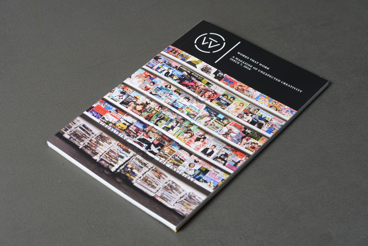
WTW magazine cover, issue no. 7 (2016)
author: Peter Biľak, worksthatwork.com
Logotype of WTW in a form of lettering by Ondrej Jób (Setup)
author: Ondrej Jób, urtd.net
Custom typeface
author: Peter Biľak, worksthatwork.com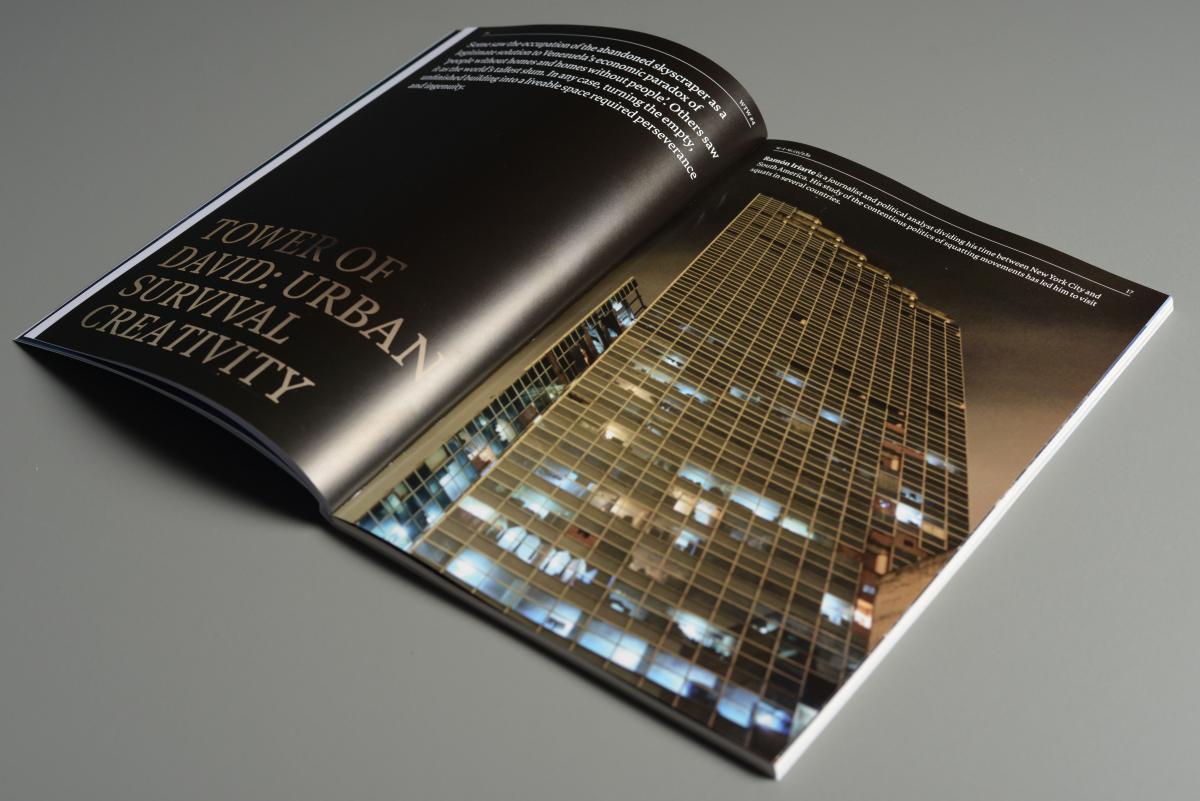
Preview of magazine pages
author: Peter Biľak, worksthatwork.com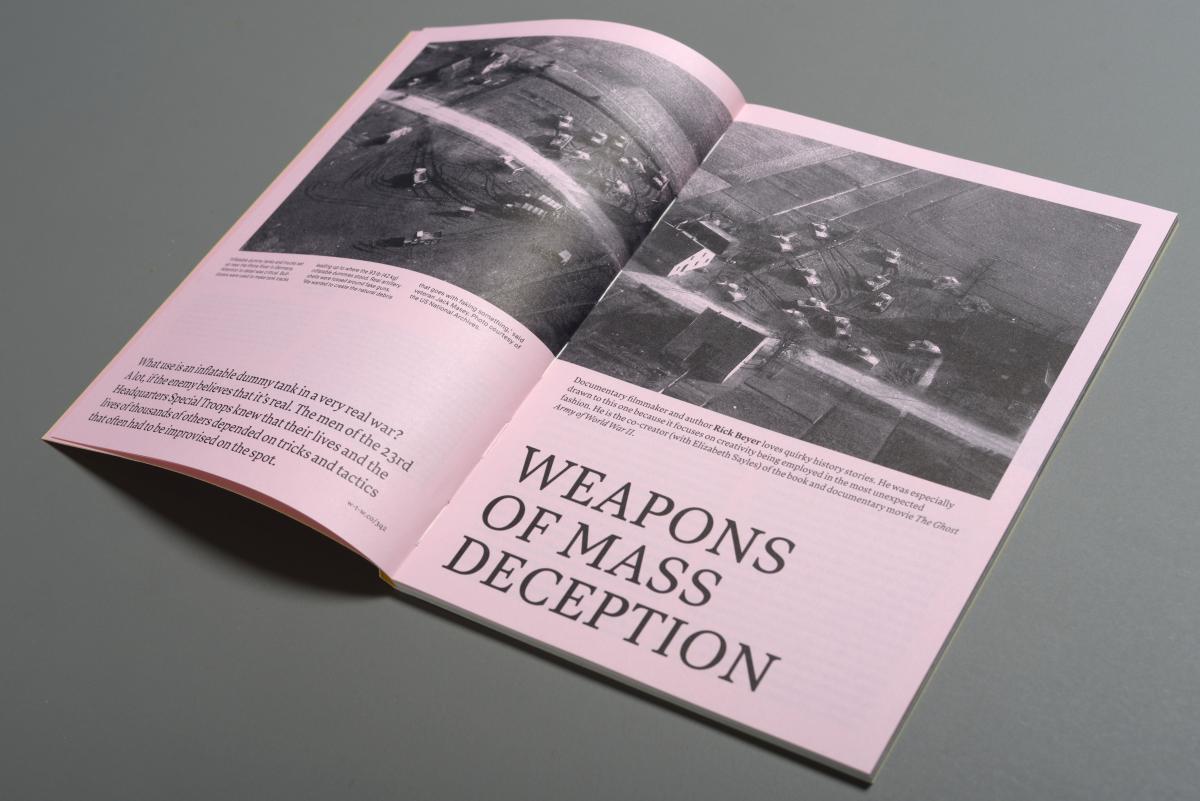
Preview of magazine pages
author: Peter Biľak, worksthatwork.com
Switching to Otabind binding, developed and patented in the 1980s by the Otava Bookbinding Company in Finland
author: Peter Biľak, worksthatwork.com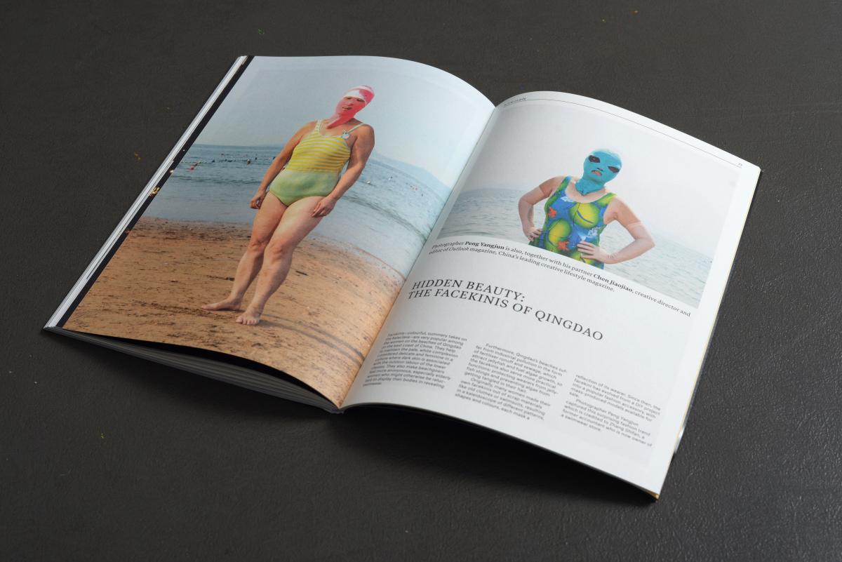
Preview of magazine pages
author: Peter Biľak, worksthatwork.com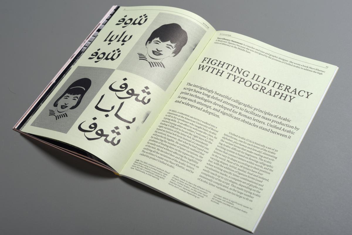
Preview of magazine pages
author: Peter Biľak, worksthatwork.com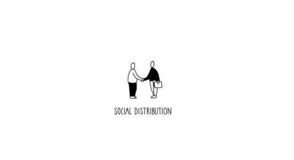
Social distribution promo video
author: Typotheque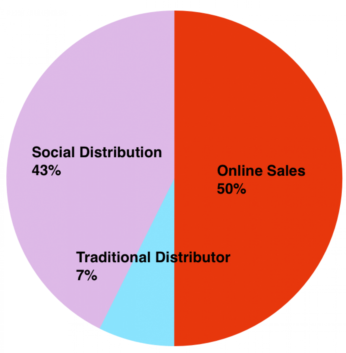
Social distribution success graph
author: Peter Biľak, worksthatwork.com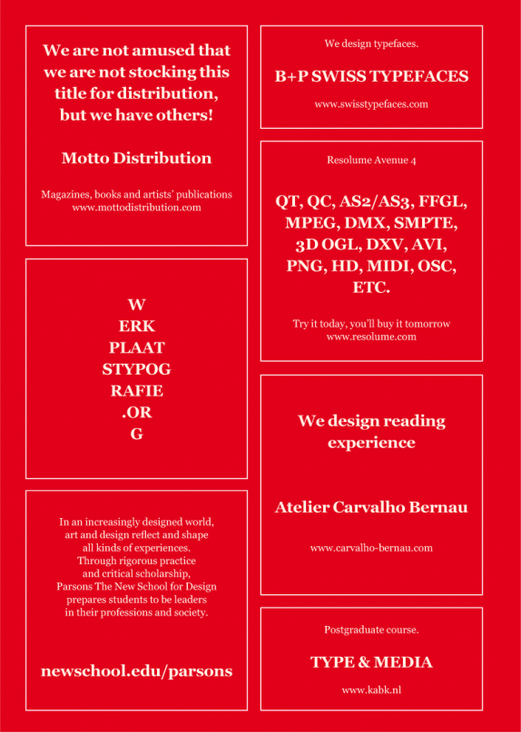
Ad page @WTW
author: Peter Biľak, worksthatwork.com
Anna Ulahelová 25–05–2017 16:26
I agree with Ester Nemcova. I just simply like on this project different point of view for design and its understanding which is more opened for user/public/everyday life thinking. I also appreciate multidisciplinary approach and mixing disciplines as design, sociology, environment, communication etc. I like idea about distribution of magazine on other side is not still quite luxury artefact just for people who have already knowledge something about design? Then another question comes: Is this magazine again just for closed community of people and professions?