Project Manual Grotesk
Rescue handwritten fonts used on our street signs!
The Project Manual is reflecting the origin and the actual situation with the specific handwritten font that was used on street signs in Slovakia since 50s. It describes how these signs were made, and how they were formed from the beginning to the present time.
Author of this project is Ondrej Jób, the well known Slovak typographer and graphic designer. His inspiration appeared, when Ondrej began to launch instagram profile @typeatlas, where he shares photos of old signs or logos placed on buildings. His goal was to find uniform, custom made signs.
During his survey Ondrej notices that this font appeares in variable shapes, and that the signs are always original on different places in Slovakia. For example in Banská Štiavnica these signs were handwritten or signs in High Tatras were completely original and specific. Ondrej named it therefore the Manual Grotesk.
Manual Grotesk was used during the former communist regime for password and public inscriptions. Street sings appeared in Slovakia in the 1950s and they all were made in the national enterprise Kodreta Myjava. Richard Pípal‘s publication dates from the same period, so it is likely that the design and font were designed by some of Kodreta‘s employees, who knew this publication. As Kodreta was the only company to produce signs, it was not necessary for the design to be defined in technical standards or laws.
Thesedays, these signs are being dramaticaly deformed. This happens especially after the reconstruction of the building or its insulation. We can find them made of plastic and the original manual grotesque font is replaced by a distorted Arial or similar sans serif font.
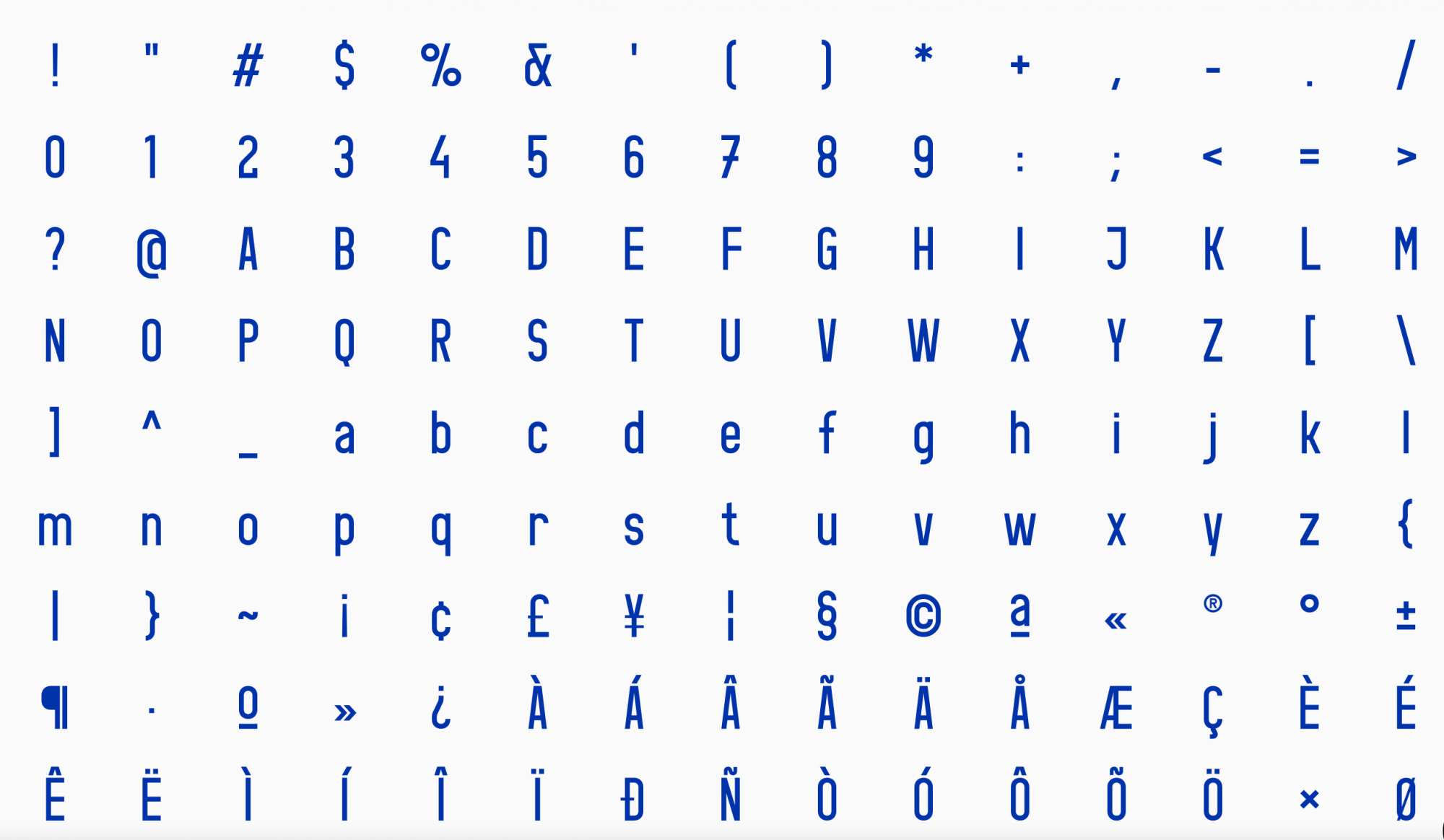
The reason for using the Manual Grotesk font was its construction made of straight lines and circles. To construct the leters only divider and ruler was enough. It had a fixed width, which was given by the deviation from the width of the letter H. Also, the construction of this font was mastered by every graduate of a secondary vocational school, whose focus was at least marginally related to the lettering.
Therefore, in practice, the Manual Grotesk font was created using a stencil, hand painting, wood or metal or stone carving. In this way, the tables gained originality. Their small imperfections showed that the Manual Grotesk was a exible system and behind the each sign was a specific designer. And that’s the exact human element we can‘t find in the digital writing. It is possible to imitate, but analog fonts are always rare.
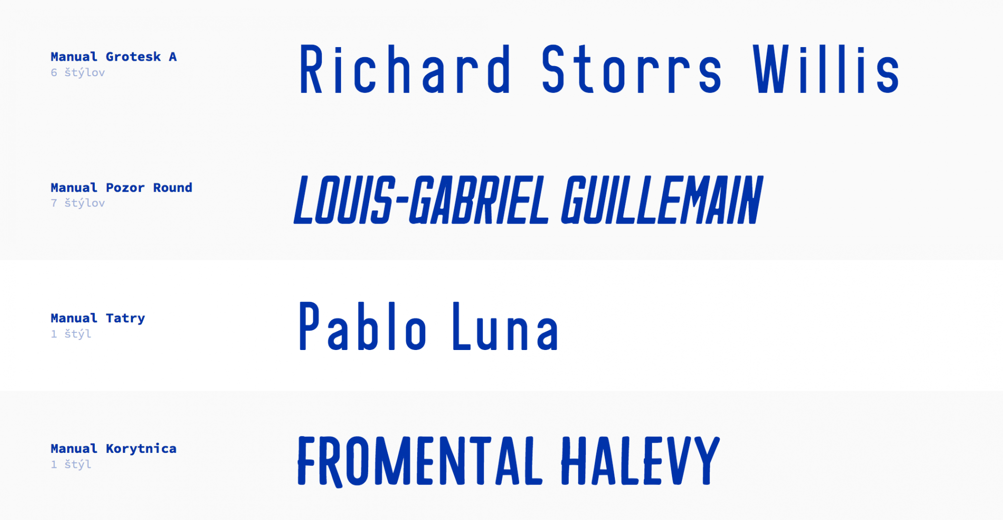
As a result Ondrej designed and digitally made several sections of the Manual Grotesk according to the original designs of hand-painted signs. His intention was to prevent possible deformation , to preserve the original appearance and to allow usage of this font in the correct form and shape as was in the past.
We do not yet know whether he will be able to implement this project in practice, but it would be beautiful.
license: Copyright
Manual Grotesk , web site, printscreen, 2020
author: Alexander Alan Arcelicense: Copyright
Manual Grotesk , web site, printscreen, 2020
author: Alexander Alan Arcelicense: Copyright
Manual Grotesk , web site, printscreen, 2020
author: Alexander Alan Arcelicense: Copyright
Manual Grotesk , web site, printscreen, 2020
author: Alexander Alan Arcelicense: Copyright
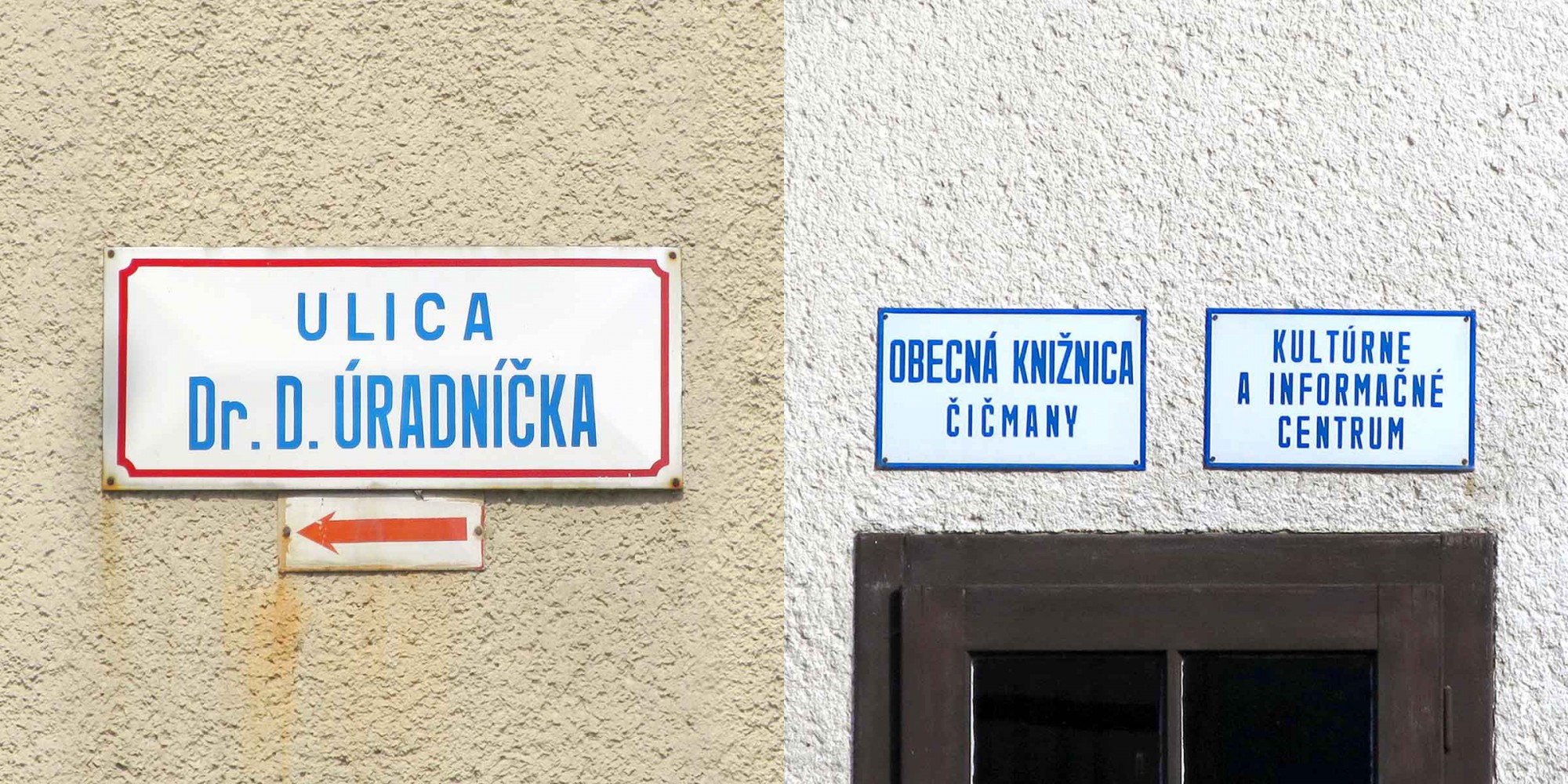
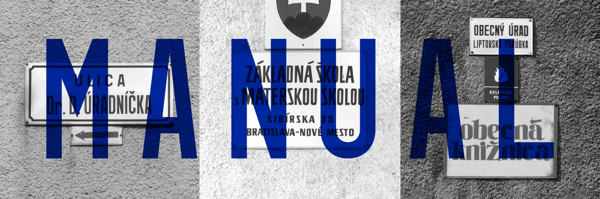
original street signs
author: Alexander Alan Arcelicense: Copyright