Project Visual identity of Bratislava Castle
Signage which helps you to get lost
Slovakia is missing a concept. We can definitely agree on that. The visual identity of our country and our city, lacks consistency and thought-out systematic solutions that would make life of its citizens and tourists much easier.
Tourism is vital, as it represents a support for the growth of local economies in the country. But are the services that we offer to tourists satisfactory at all? The competent persons, it seems, have never been tourists in a foreign city, or a foreign country. Visual communication created for tourists must be clear, simple and identifiable in the sea of visual smog.
Bratislava Castle is one of the most visited tourist attractions of the capital city of Bratislava; it is a place that combines its unique history with a view of the city and Danube river basin. It has a remarkable potential as it is both a historic monument and a place to unwind attracts locals and foreign visitors.The Bratislava Castle complex has, in recent years, undergone a revitalization - its exteriors and interiors earned their long-awaited facelift. Nevertheless, the castles' visual communication and identity have remained unnoticed. The correct setting of such communication has a direct impact on the impressions and overall enjoyment of tourists - the first impression during a visit is a key element in the tourism-hospitality industry. Currently, the state of the castles' information communication has nothing but a confusing effect on its visitors, and is rather humiliating when compared to foreign standards.
Several problems can be identified, therefore I would like to point out the inconsistency in these particular issues: in the information system (visual style, font use, colorscale), insufficient visibility of entrances and internal navigation, outdated form of presenting the castles' history (media channels: web, print), or the language barrier present in all information signage (Slovak-English). All these mentioned inadequacies present an great opportunity for improvement.
For that reason, my friends and I prepared a detailed research on the issue, and by the means of photodocumentation, we mapped the current situation. We wrote a project brief, including our aims and intentions, and applied for a finantial support at Viac Dizajnu programm (More Design) organized by Tatra Banka.
Unfortunately, we did not succseed.
We are aware that the visual identity of a historical monument of such national value should be a part of a greater whole – the visual identity of state itself – we do not yet know when this shift will occur. We hope that the visual identity of the castle will soon undergo a redesign that would change its current, inappropriate and insufficient, state.
This project was created during the course Critic – Critical practice in Graphic Design at Department of Visual Communication at Academy of Fine Arts and Design in Bratislava. Tutored by Katarína Balážiková. The course foucuses on practicing and developing individual or collaborative critical projects.
license: Attribution-ShareAlike

More is more
author: Jozef Šimolicense: Licenced by author of the image, please contact author personally.

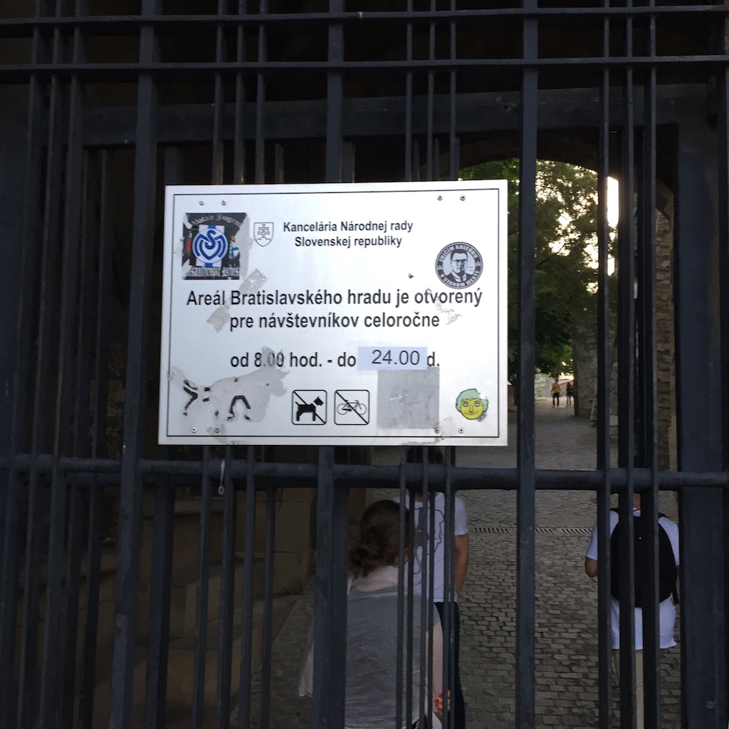
Visual communication of the historical monument at it's best
author: Jozef Šimolicense: Licenced by author of the image, please contact author personally.
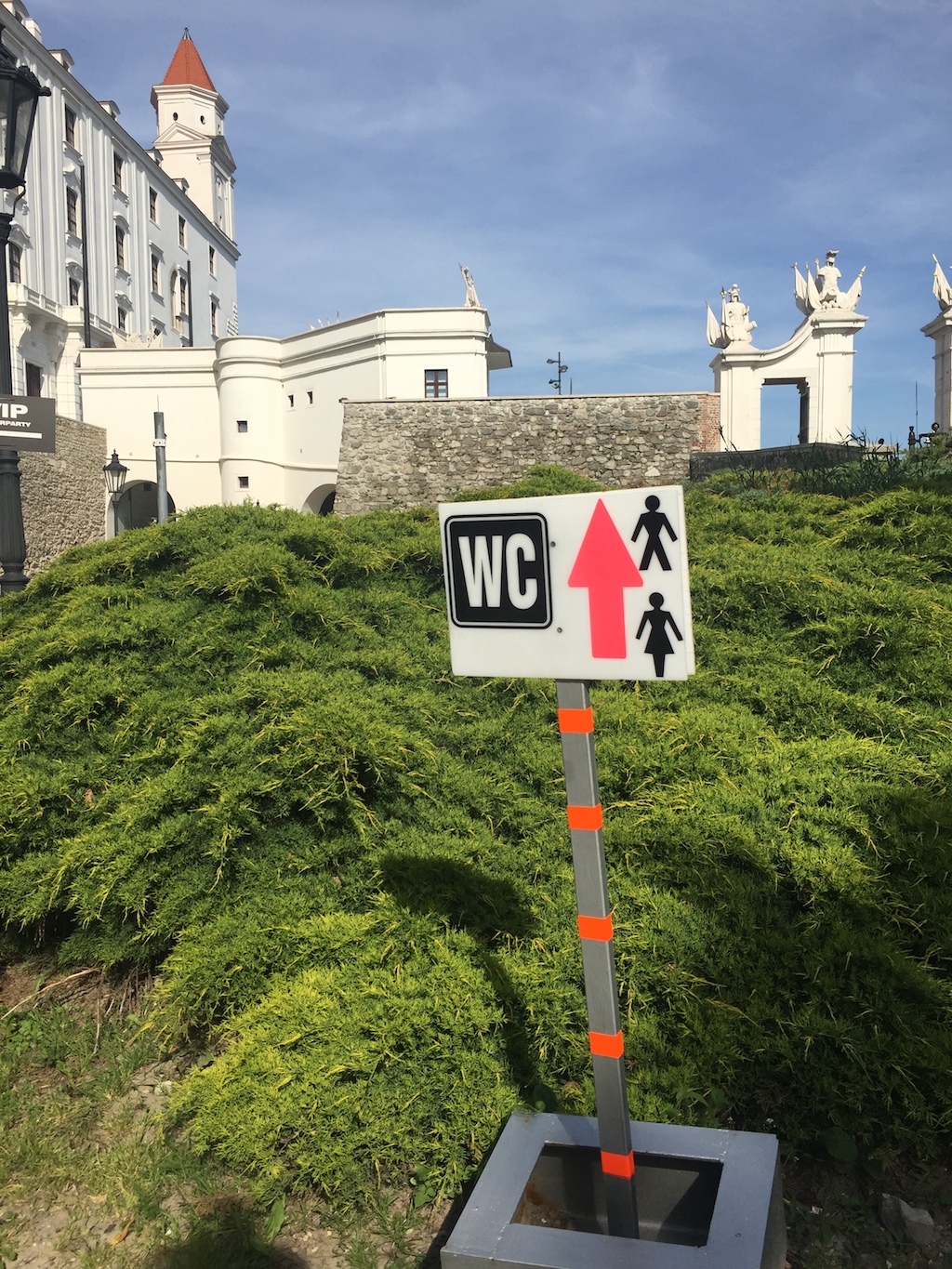
All you need to know about Slovakia
author: Jozef Šimolicense: Licenced by author of the image, please contact author personally.
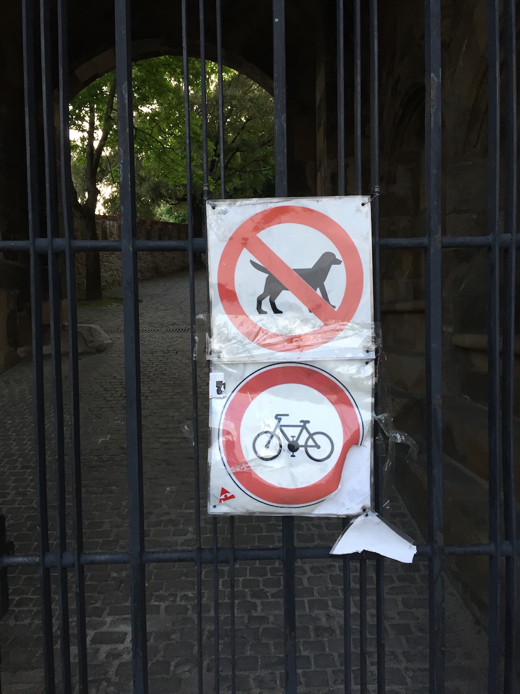
Plastic fantastic
author: Jozef Šimolicense: Licenced by author of the image, please contact author personally.
license: Licenced by author of the image, please contact author personally.
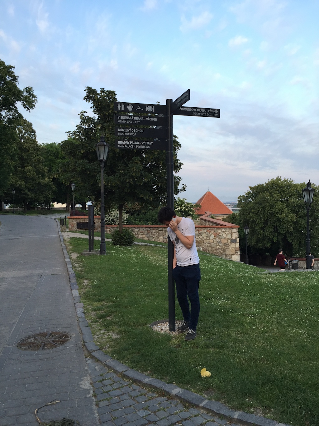
There is a hope
author: Jozef Šimolicense: Licenced by author of the image, please contact author personally.