Amsterdam-based graphic design studio Experimental Jetset, was founded in 1997 by Marieke Stolk, Erwin Brinkers and Danny van den Dungen. They are focused on printed matter and site-specific installations. They usually work with typeface and present their methodology as „turning language into objects”.
The studio members grew up in '70, it’s no surprise that they use Helvetica as a main typeface and they use it as their mother language. Their work is mostly based on typography and ways how to work with it, but they are conservative in the selection of typefaces. Using Helvetica, Futura or Univers as main means of expression could be restrictive, but on the other side it makes their projects recognisable.
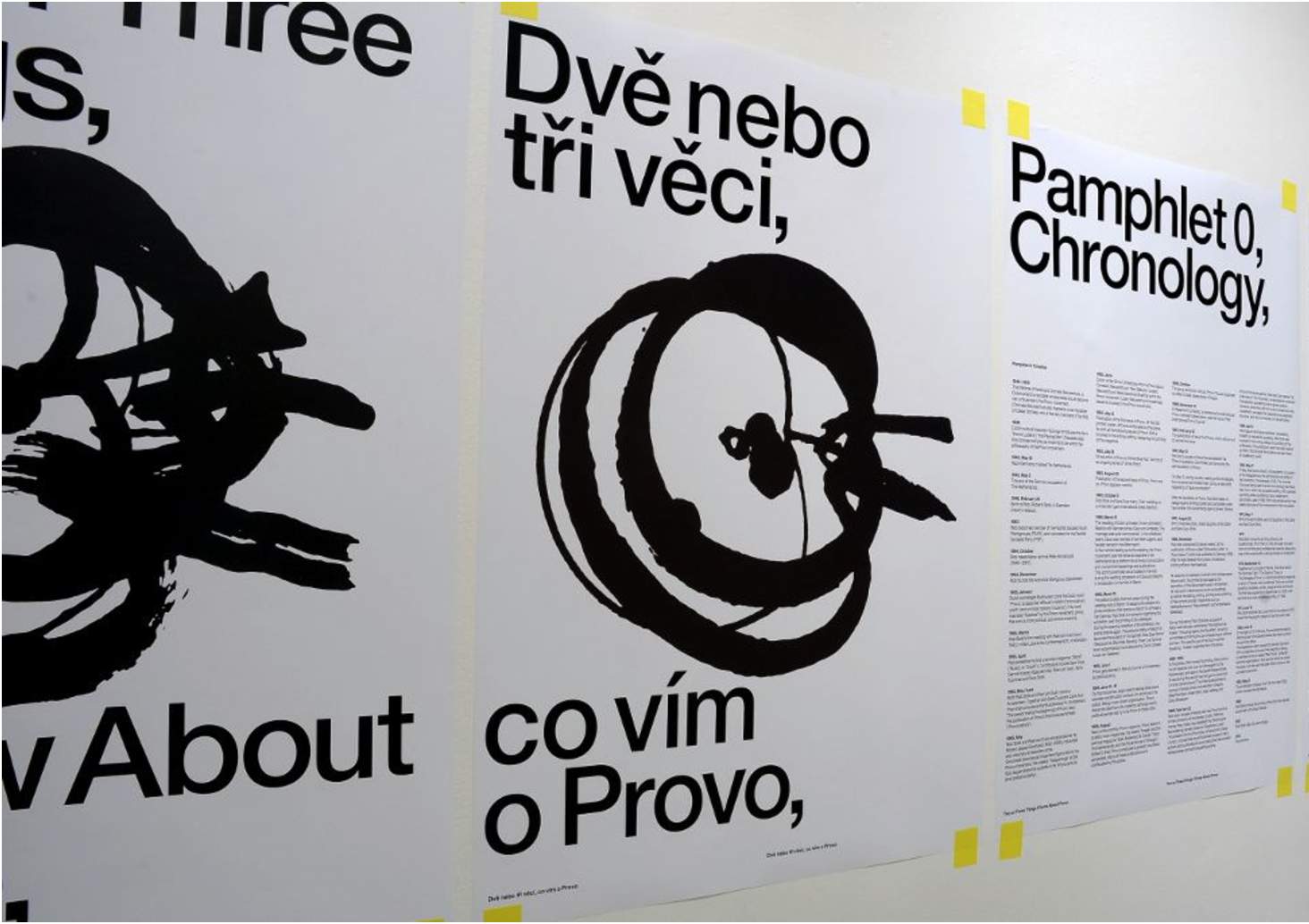
They are also focused on curatorial concepts for exhibitions. One extended version of exhibition was at the Biennial of Design in Brno in 2012. The subject of exhibition was the Provo movement, anarchistic organisation active in Amsterdam (1965 - 1967). It was partially conceptual activistic and political movement, that helped to shape a cultural and political landscape.
Provo were editors of the journal "De Tand des Tijds", which was printed by founding member Rob Stolk, a father of Marieke Stolk.
This exhibition, „Two or Three Things I Know About Provo” was focused mainly on him. The exhibition was conceiving as incomplete archive of materials. The concept of archive was showed in the special arrangement of exhibition - plenty of papers were sticked on walls with tape.
Even the exhibition is conceived as archive created by various materials, they keep their typical visuality of sans-serif typeface with nice fusion of features from Provo movement, which make a contrast between pure typeface design and artistic forms.
I think, we could consider Experimental Jetset as graphic designers, architects and also a critical organisation, balancing between the design as applied art and art in meaning of express opinions and reflexions. Even they works on different projects begins by visual identity and ends as curators of exhibition, Experimental Jetset keep their way of expression, what is not common.
Exhibition (Brno 2012)
author: https://www.experimentaljetset.nl/archive/two-or-three-things-1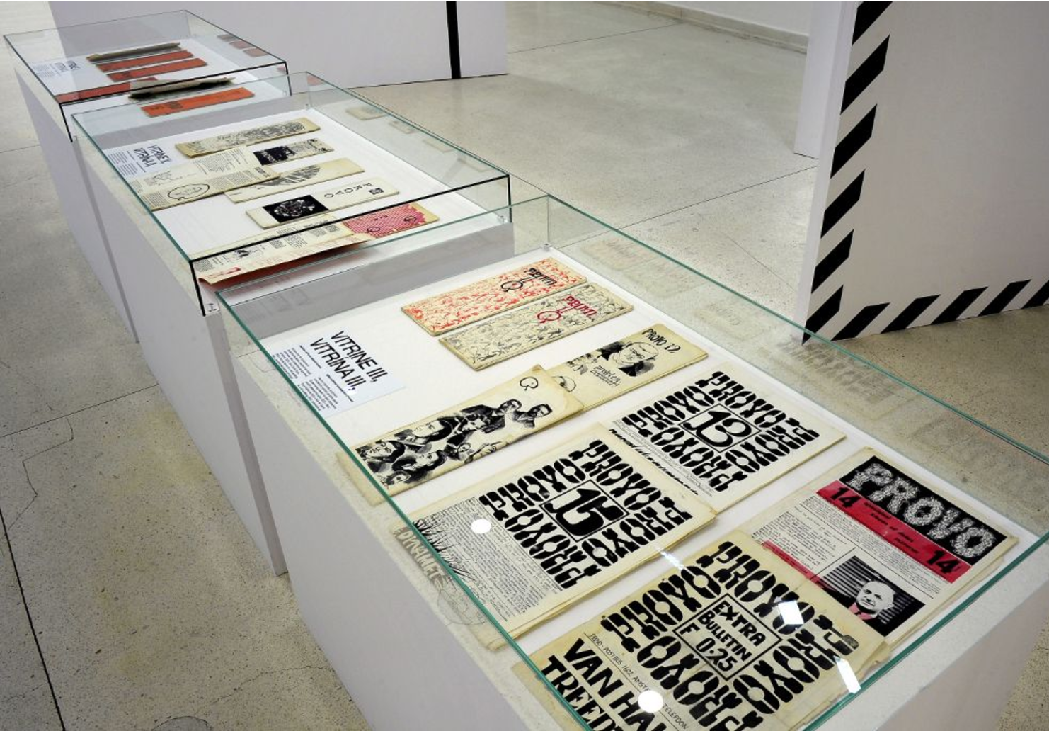
Exhibition Brno
author: https://www.experimentaljetset.nl/archive/two-or-three-things-1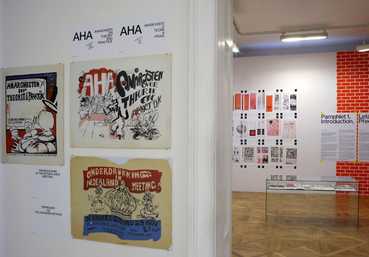
Exhibition (Brno)
author: https://www.experimentaljetset.nl/archive/two-or-three-things-1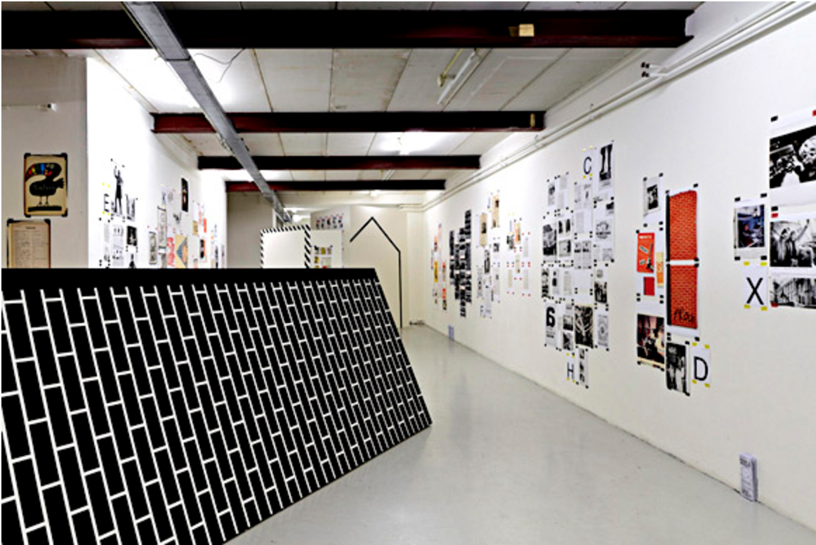
wooden construction as a symbol of relation between printed matter and the city (Amsterdam 2011)
author: https://www.experimentaljetset.nl/archive/two-or-three-things-1