Jan van Toorn was born in 1932, and is one of Holland's most influential graphic designers. Central to his approach is the application of content-based strategies, resulting in a design practice as a form of visual journalism. Opposite to the more self-contained designs of the modernist tradition, Van Toorn is always striving for designs that are open to different ways of seeing.
His approach is crucial for the development of (not only) Dutch critical design practice. We could see his design practice as a powerful demonstrations of graphic design used as a means of commentary and as a tool of critique.
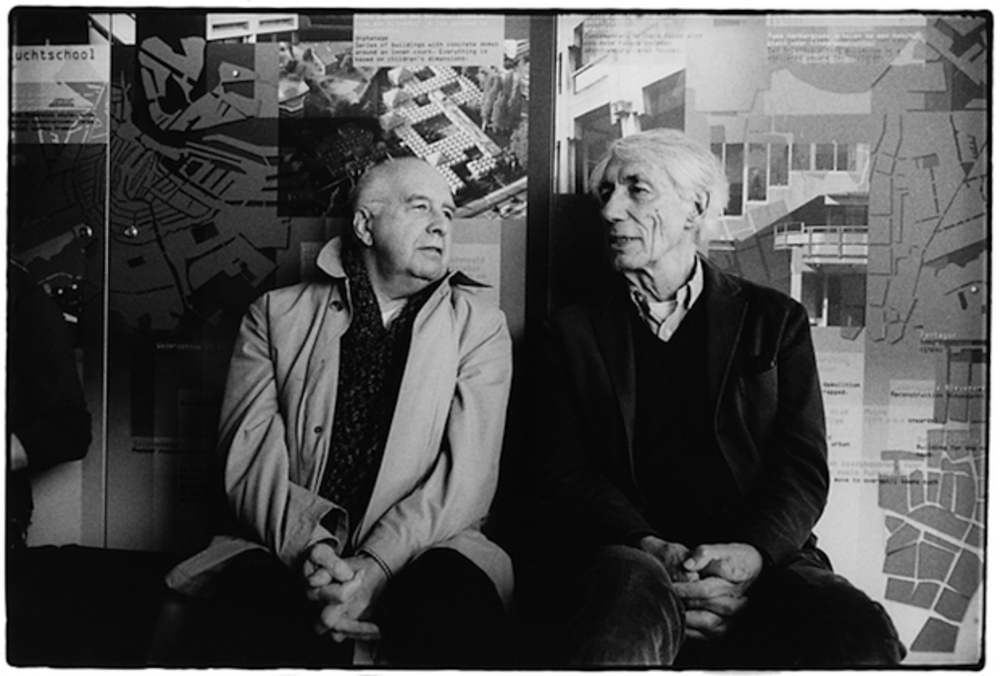
To understand the principles of critical practice, we can acctually compare van Toorn approach with the one from his collegue Wim Crouwel. Both of them deigned posters for a similiar client and same communication goal, both designed back in 1972. In these two posters - as great examples - we can see complete opposite approach - a formalistic one of Crouwel and analytical and critical approach of van Toorn.
In the same year, these two guys as "giants of Dutch graphic design" gathered in Amsterdam to publically debate on the occasion of a joint exhibition of their works. Aileen Kwun wrote in the Surface magazine, that Crouwel, known for his proto-digital typefaces, argued for a rational, neutral approach that cast the designer as a visual translator. According to his words, designer must never stand between the message and its recipient.
Van Toorn had an oposite opinion about the role of graphic desiger and design. In this debate he insisted that design was inherently subjective. He explained that he was always driven by cultural and political currents and that graphic design can not be neutral and objective, because it has a social meaning and social goals.
The discussion is one of few within the world of graphic design that put design into such complex assumtions and doubts about the role of designer. It was a strong demonstration of two individuals absolutely refusing to compromise on their opinions. But (and not only) to me, it was very positive moment that influenced many designers, design theorists and researchers to reconsider their practice, design thinking and approach.
More resources:
http://designobserver.com/feature/the-debate/38883/
https://www.surfacemag.com/articles/20151022the-debate-between-dutch-designers-wim-crowed-and-jan-van-toorn-no-longer-lives-only-in-our-memories/
https://www.amazon.com/Debate-Legendary-Contest-Giants-Graphic/dp/1580934129
http://dutchdesigndaily.com/new/the-debate/
https://www.grafik.net/category/feature/heated-debate
author: The Monacelli Press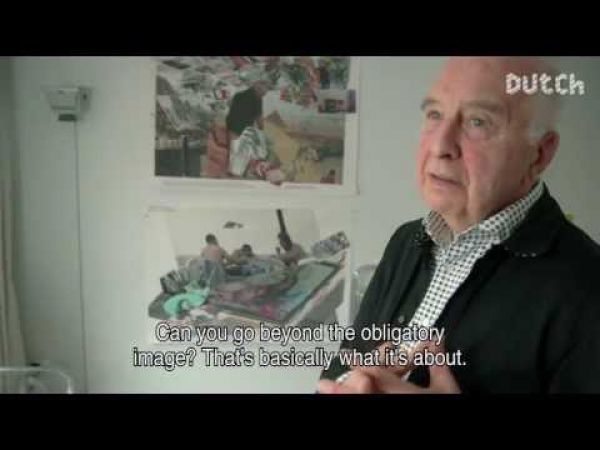
Jan van Toorn on you tube channel
author: Dutch Profiles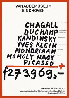
Jan van Toorn, A Selection from the Collection, poster, 1971
author: Jan van Toorn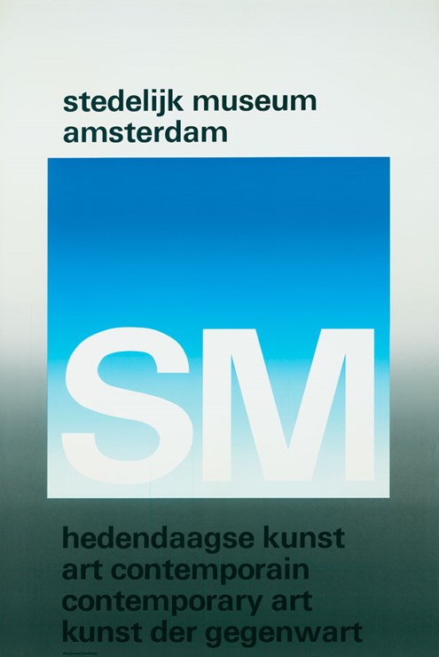
Win Crouwel, Hedendaagse Kunst, poster, 1971
author: Win Crouwel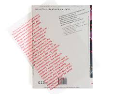
Design's Delight, book, 2004
author: Jan van Toorn
Design's Delight, book, 2004
author: Jan van Toorn
Design's Delight, book, 2004
author: Jan van Toorn